Brand Style Guide
A comprehensive reference for maintaining visual consistency across the TWP website, presentations, and all brand touchpoints. Every color, font, spacing value, component, and image asset documented in one place.
Every color, documented.
The TWP palette is built on deep navy foundations with a single electric emerald accent. White is used at varying opacities to create a layered typographic hierarchy. All colors are defined in OKLCH for perceptual uniformity, with hex approximations provided for convenience.
Three fonts, one system.
The typographic system pairs an editorial serif for display headlines with a geometric sans-serif for body text and a monospaced face for data readouts. This creates a "publication meets terminal" aesthetic that reinforces TWP's data-driven positioning.
The primary brand fonts (Instrument Serif, Geist, JetBrains Mono) are web-only fonts loaded via Google Fonts CDN. Because these typefaces are not universally available in presentation software, the branded PowerPoint / Google Slides template uses the following approved fallbacks that preserve the typographic intent of the brand as closely as possible.
Weights: Regular (400), Italic (400i), Bold (700), Bold Italic (700i).
Weights: Regular (400), Bold (700).
Weights: Regular (400), Bold (700).
Structure & rhythm.
Generous vertical rhythm with 120px+ section padding creates a publication-like reading experience. The grid system uses a centered container with responsive padding and a 1360px max-width.
| Property | Value | Usage |
|---|---|---|
| Section Padding (Desktop) | py: 9rem (144px) | Vertical padding for all major content sections |
| Section Padding (Tablet) | py: 6rem (96px) | Reduced vertical padding below 1024px breakpoint |
| Section Top Offset | pt: 6rem (96px) | Additional top padding after section divider line |
| Container Max Width | 1360px | Maximum content width on desktop (1024px+) |
| Container Padding (Mobile) | px: 1.25rem (20px) | Horizontal padding below 640px |
| Container Padding (Tablet) | px: 2rem (32px) | Horizontal padding 640px–1024px |
| Container Padding (Desktop) | px: 3rem (48px) | Horizontal padding above 1024px |
| Card Grid Gap | 1.25rem (20px) | Gap between service cards, feature cards, proof points |
| Section Heading → Content | mb: 4rem–7rem | Space between section heading and first content block |
| Navbar Height | h: 5rem (80px) | Fixed navbar height on desktop (h-20) |
| Border Radius | 0.5rem (8px) base | Base radius. Cards use rounded-sm (calc(0.5rem - 4px) = 4px) |
| Scroll Margin Top | 5rem (80px) | Offset for anchor links to clear fixed navbar |
| Layout | Grid | Where Used |
|---|---|---|
| Services Grid | grid-cols-2 lg:grid-cols-4 | 8 service capability cards |
| B2B / B2C Panels | grid lg:grid-cols-2 | Side-by-side audience panels |
| Metrics Row | grid-cols-2 lg:grid-cols-4 | Results section counter metrics |
| Proof Points | grid sm:grid-cols-2 | 4 case result cards |
| Case Studies | grid md:grid-cols-2 lg:grid-cols-3 | 3 editorial case study cards |
| AI Features | grid sm:grid-cols-2 lg:grid-cols-3 | 6 AI capability feature cards |
| Client Logos | grid-cols-2 sm:grid-cols-4 lg:grid-cols-8 | 8 placeholder client logo cells |
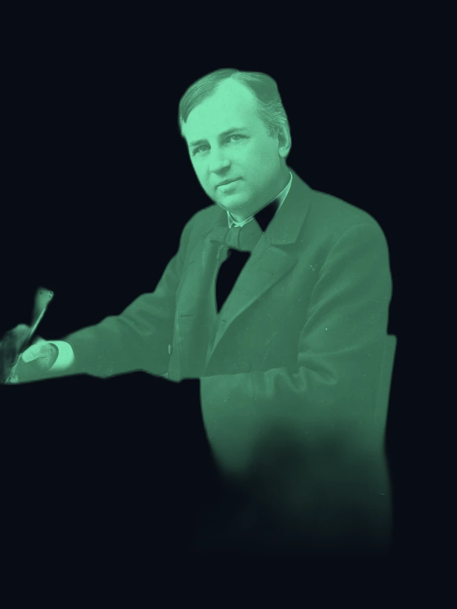
| Wanamaker Section | grid lg:grid-cols-12 (7+5) | Text column (7/12) + image column (5/12) |
| AI Section Top | grid lg:grid-cols-2 | Text + comparison left, AI visual right |
| Footer | grid-cols-2 lg:grid-cols-12 | Brand (4) + 3 nav columns (2 each) + CTA (2) |
Components, rendered.
Live rendered examples of every reusable UI component on the TWP website. Each component follows the Precision Architecture design system.
Secondary: Transparent, white/15% border. Used for secondary actions.
Ghost: Primary/10% fill, primary border. Used in footer and compact contexts.
Programmatic & Display
AI-optimized programmatic buying across premium inventory, with real-time bidding intelligence.
Connected TV & OTT
Precision-targeted CTV campaigns with household-level attribution.
B2B Marketers
We speak your language — MQLs, SQLs, pipeline velocity, and closed-won revenue.
Visual assets.
Every image used on the TWP website. All assets are AI-generated and served via CDN. Local copies are available in /twp-style-guide/images/ for use in presentations.


Depth & atmosphere.
Gradients, glow effects, and border treatments that create the layered, atmospheric feel of the TWP brand.
Motion & interaction.
All animations use Framer Motion and are triggered by IntersectionObserver scroll detection. The motion language is restrained and purposeful — elements reveal as the user scrolls, creating a sense of progressive disclosure.
Scroll Reveal — Fade Up
The primary entrance animation. Elements start with opacity: 0, y: 30 and animate to opacity: 1, y: 0 over 0.7–0.8s with staggered delays (0.1–0.15s between siblings). Triggered once when the element enters the viewport at 8–15% visibility threshold. Used on section headings, card grids, and text blocks.
Scroll Reveal — Slide In
Horizontal entrance for split layouts. B2B panel: x: -30 → 0. B2C panel: x: 30 → 0. Section labels slide from x: -20 → 0. Duration 0.6–0.8s. Creates a sense of content assembling from the edges.
Metric Counter Animation
Numbers count up from 0 to their target value using requestAnimationFrame with an ease-out cubic curve: 1 - Math.pow(1 - progress, 3). Duration: 2.2 seconds. Triggered once on scroll visibility. Decimal values (e.g., 2.8x) use toFixed(1). Before animation triggers, displays "—" as placeholder.
Scale Reveal — Images
Images (Wanamaker portrait, AI visual) enter with opacity: 0, scale: 0.9–0.95 and animate to opacity: 1, scale: 1 over 0.9–1.0s. Creates a subtle "emerging from depth" effect that draws attention to visual assets.
Hero Entrance Sequence
The hero section plays a choreographed entrance on page load (no scroll trigger needed): eyebrow label (0.2s delay) → headline (0.35s) → subheadline (0.55s) → CTA buttons (0.7s) → stats bar (0.9s). Each element fades up from y: 20–40. Total sequence: ~1.7 seconds.
Hover Transitions
All interactive elements use CSS transitions with 300–500ms duration: card borders shift from white/5% → primary/20%, card backgrounds brighten subtly, nav links transition color, CTA buttons use filter: brightness(1.1), and the secondary button border shifts to primary/40%. Arrow icons translate x: 0 → 4px on button hover.
Navbar Scroll Behavior
The navbar starts transparent and transitions to a solid background with backdrop-blur(20px) after scrolling past 50px. Uses a scrolled state boolean that toggles the background class. Transition duration: 500ms on all properties.